After spending so much time in the SaaS world and getting hands-on with designing sites that make a real difference, we got thinking. Why not share this with everyone? So, we put together a list of the 15 best SaaS sites for design inspiration.
Let’s be honest, some SaaS websites are about as exciting as a spreadsheet convention. But not all of them! We’ve been building SaaS websites long enough to spot the gems – the ones that actually make you want to click around and learn more. In this blog, we’ll share those standouts and break down the elements that elevate them from boring and basic to exceptional.
But first, let’s look at the essential features of a successful SaaS website. These elements are crucial in distinguishing your site, ensuring it connects with your target audience and drives both engagement and conversions.
Discover the best SaaS websites that exemplify the cutting-edge of web design. From compelling brand storytelling and seamless user engagement to expert use of white space, colour, and interactive elements – these websites are a masterclass. Whether you’re building or refining your own SaaS platform, get ready to be inspired by the power of exceptional design.
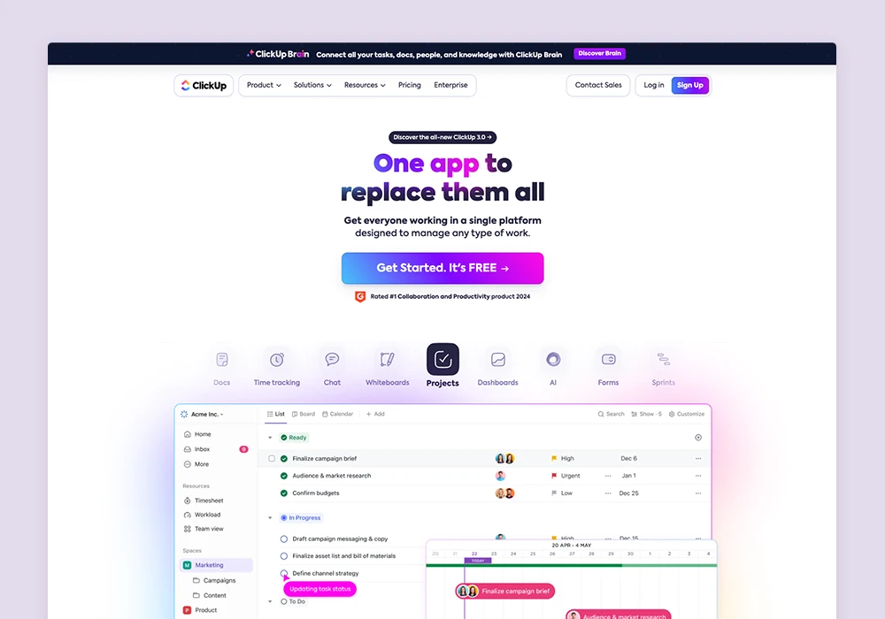
ClickUp
With a memorable clean, white overall look and feel, accentuated by bright, lively, and neon graphics and colours, this design captures attention. Featuring an intuitive navigation for an engaging user experience.
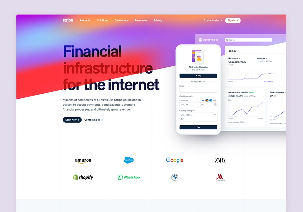
Stripe
With a developer-centric design ethos, the website greets visitors with bold, above-the-fold colours and gradients, crafting a memorable first impression.
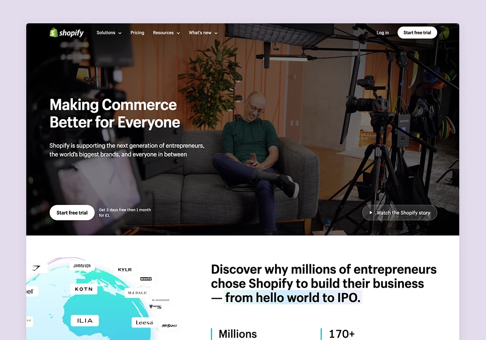
Shopify
Blending screenshots and graphics with lifestyle and people imagery effectively creates a connection with the target audience. This approach also fosters a more personal and immersive experience.
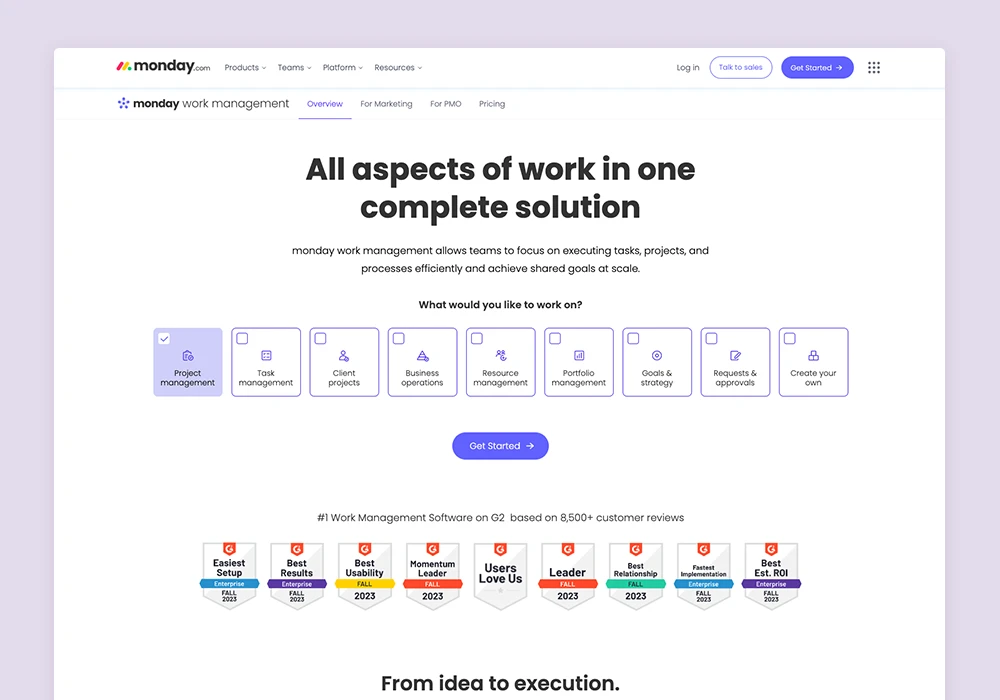
Monday.com
Combining a highly visual approach with a clean, white, and minimalist design. The use of simple software imagery and clean layouts emphasises a functional, to-the-point experience. The consistent use of purple for CTA buttons throughout the platform ensures they stand out.
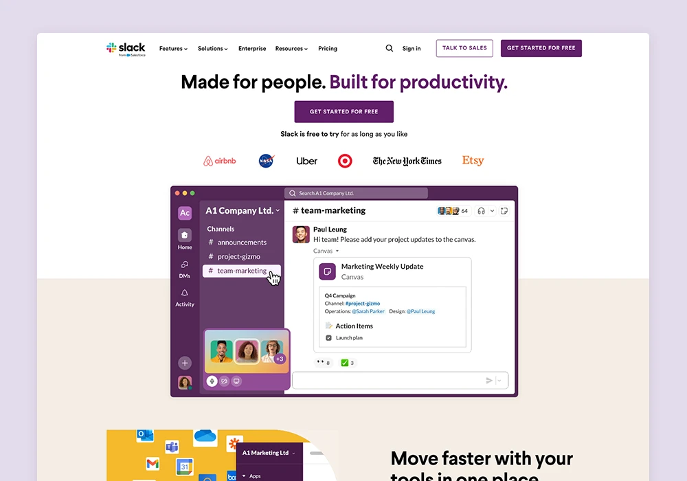
Slack
Featuring an animated product demo, allowing users to immediately grasp the software’s functionality and its advantages with ease.
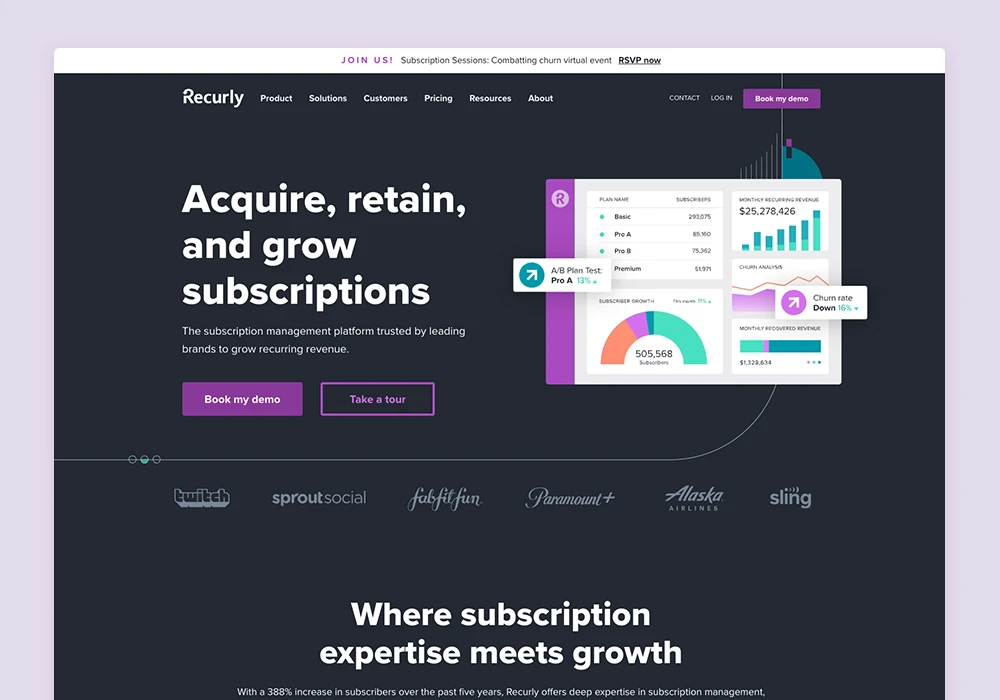
Recurly
The dark design style enhances a technical feel, making the software graphics stand out. Clean layouts and minimal content ensure information is quickly and easily understood.
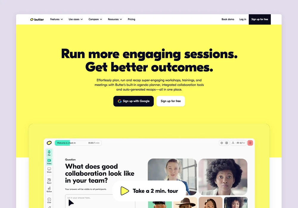
Butter
Its vibrant yellow and black colour scheme captivates, creating a memorable and standout visual identity. Its use of animated visuals enriches the user experience, making interactions more engaging. The website’s content is streamlined and focused, highlighting the software’s features and benefits directly.
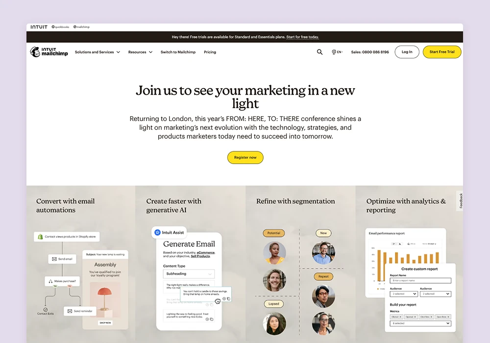
Mailchimp
Immediately captures user attention with a bold message that highlights its key benefits, reinforced by captivating yellow CTAs throughout. The seamless blending of software graphics with lifestyle and people imagery creates a compelling user experience.
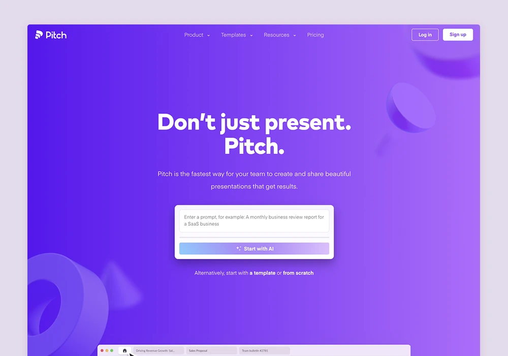
Pitch
A vibrant purple palette immediately stands out. Subtle animations throughout create a luxury feel, while clean layouts ensure that content is easily digestible and messaging effortlessly absorbed.
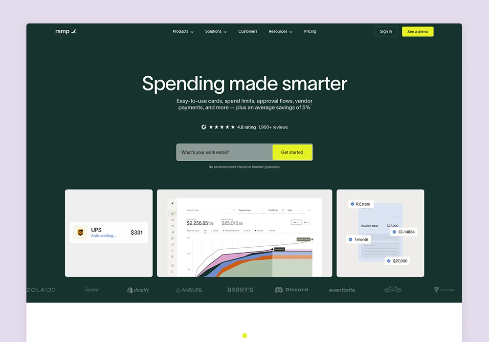
Ramp
Features contrasting neon yellow/lime CTAs that stand out well against the dark green background. Its concise messaging is immediately clear and easy to understand. Clean and straightforward product imagery is to the point and communicates information well.
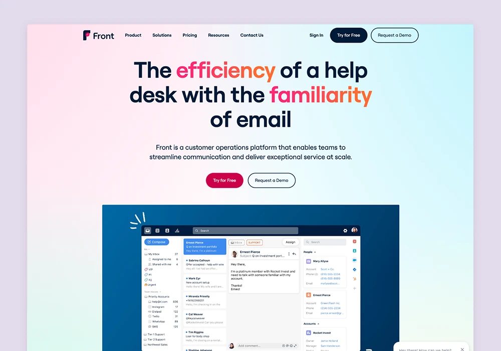
Front
Subtle gradients create a bold, memorable but clean overall feel. Bright and neon colours are strategically used to emphasise key messages and wording. The clean and simple content layouts enhance readability, making information easy to digest. Consistent use of red CTAs stands out seamlessly within the flow of the website.
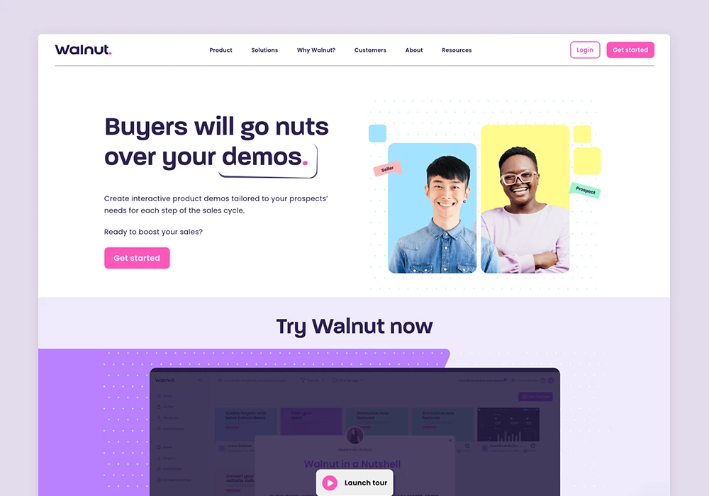
Walnut
With its use of bright colours and CTAs that grab attention, as well as clever animations further enhanced by an interactive demo and a creative video about Walnut, all wrapped in an engaging and fun tone, delivers a unique and enjoyable user experience.
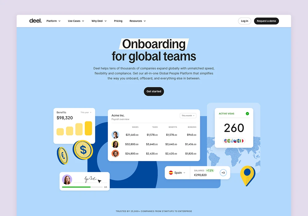
Deel
Features a minimalist layout with engaging animations, all wrapped up in a clean and colourful look for a seamless user experience.
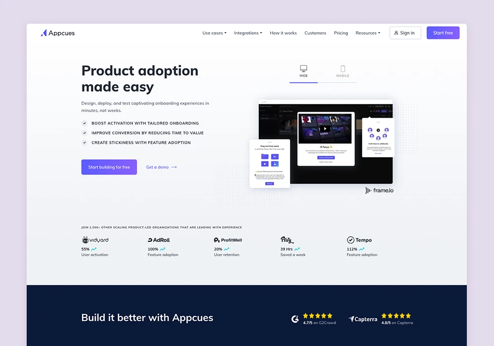
Appcues
Characterised by its simple and effective design and soft tones, makes the site easy to navigate and understand. Its standout feature is the results banner, showcasing client logos and stats, making the site trustworthy right from the start.
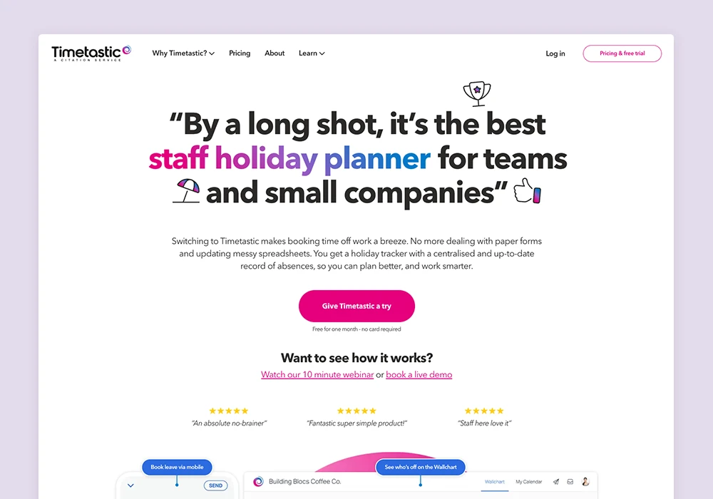
Timetastic
Timetastic opts for a unique, refreshing and minimalistic layout. With a predominantly testimonial-driven content strategy, it builds trust by showing off the good things real users have to say.
There are countless other SaaS websites already making their mark. Which is your favourite? Share with us which SaaS site you believe sets the benchmark.
As a dedicated full-service website design agency for B2B SaaS since 2009, Unicorn specialises in crafting websites that do justice to your software, enhancing lead generation through beautiful, conversion-focused, and fast website solutions.
With our proven track record, of 100+ SaaS website projects, we are the trusted partner for SaaS businesses looking to transform their digital presence.
Connect with us today for a free, no-obligation consultation and discover how we can bring your project to life. Book your free consultation here.
After spending so much time in the SaaS world and getting hands-on with designing sites that make a real...
Read more
At Unicorn, we've developed a specialised approach to SaaS website development, combining our industry expertise...
Read more
SaaS businesses thrive on innovation, including the online image they project. Your website is often the first...
Read moreDo your software justice & increase website conversions with full service outsourced website solutions just for SaaS businesses